Ed-Tech
Indiana University: IU Mobile
All Campus Essentials now in One App!
🔎 At a glance
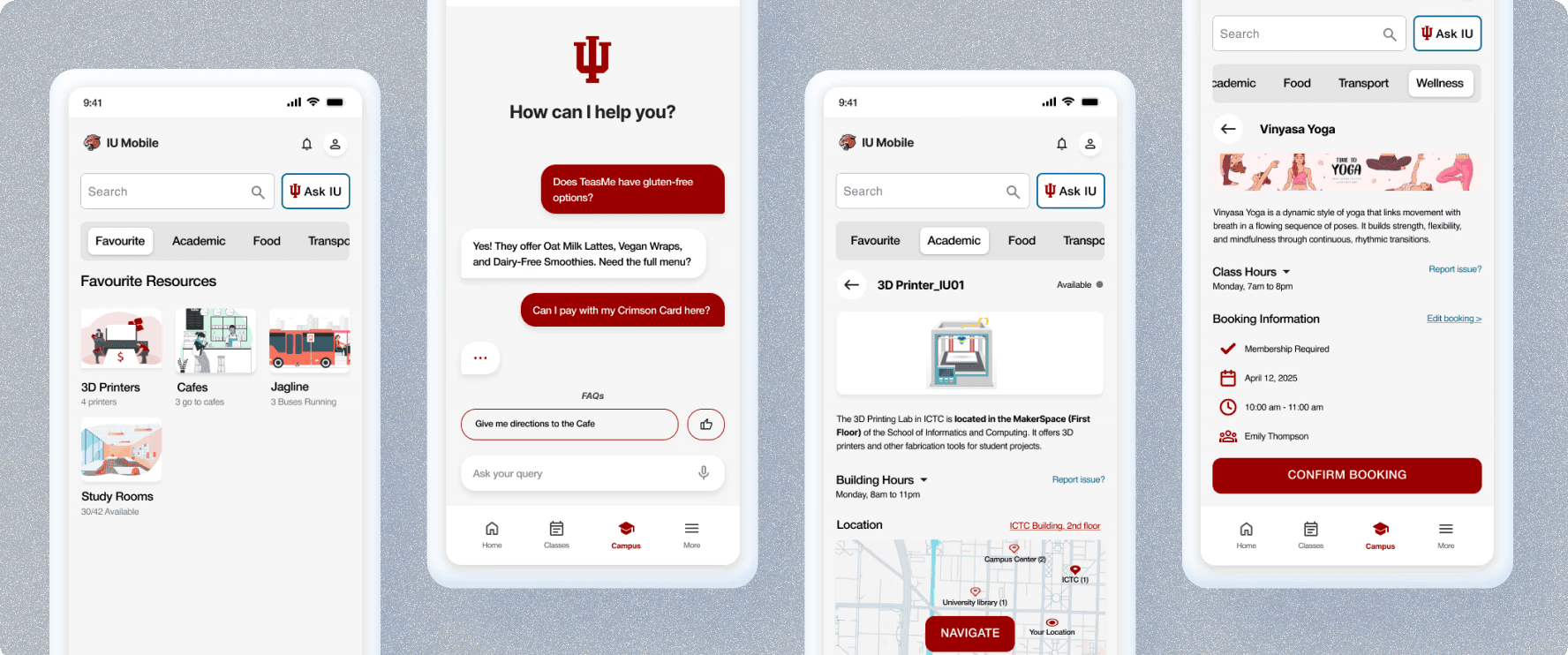
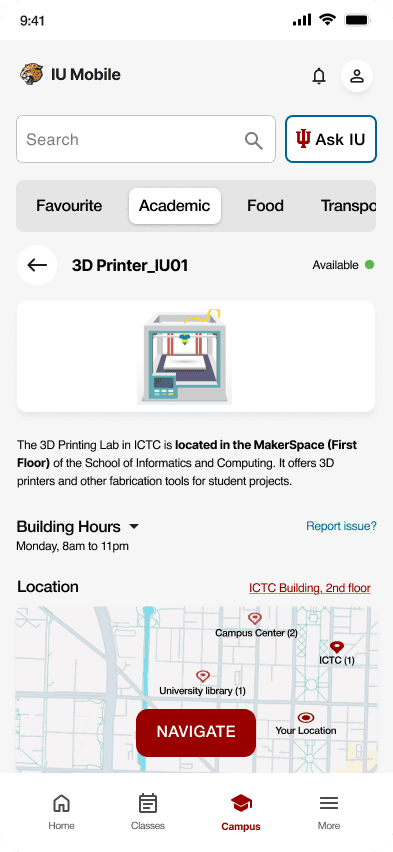
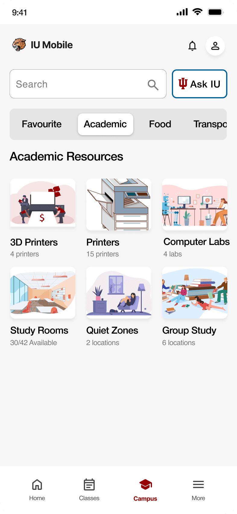
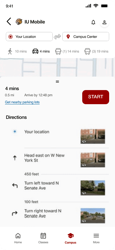
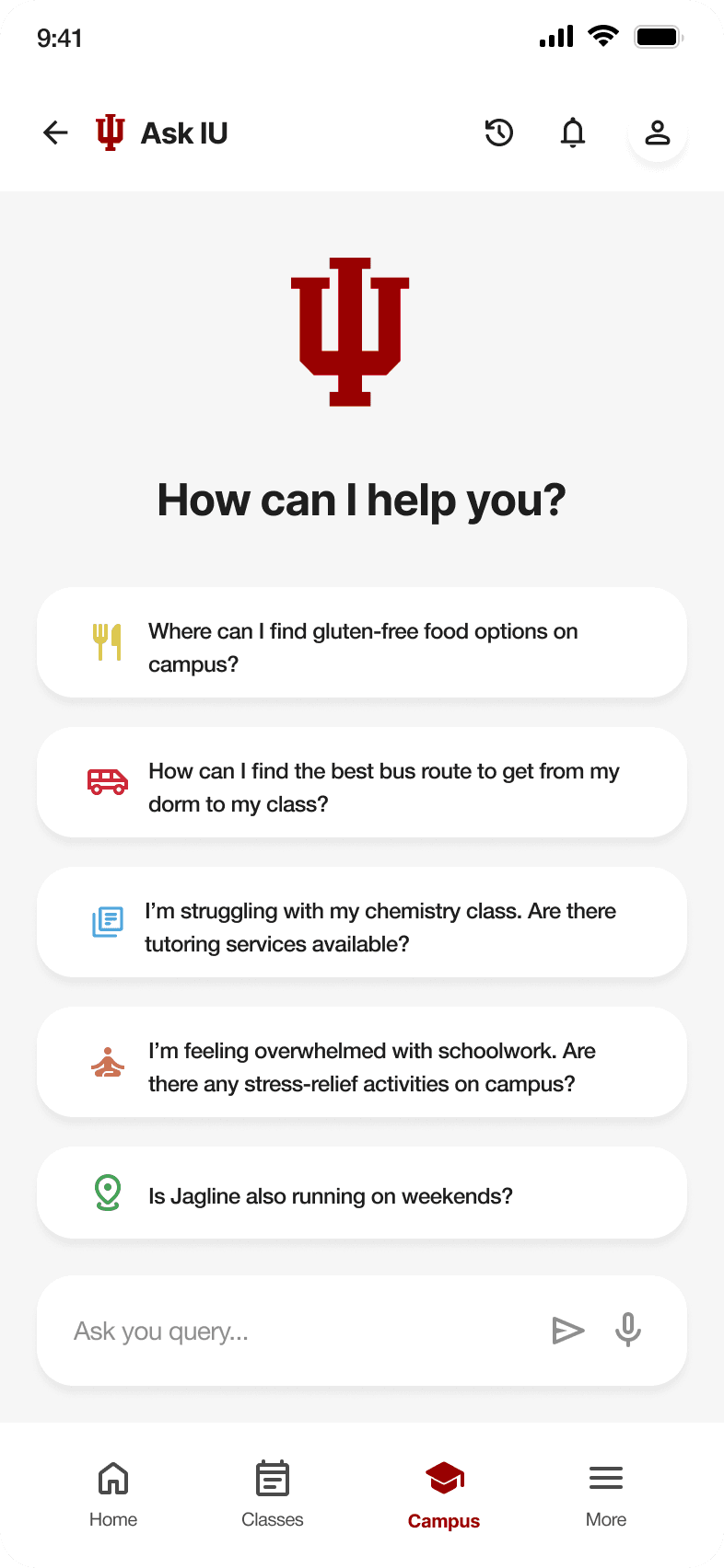
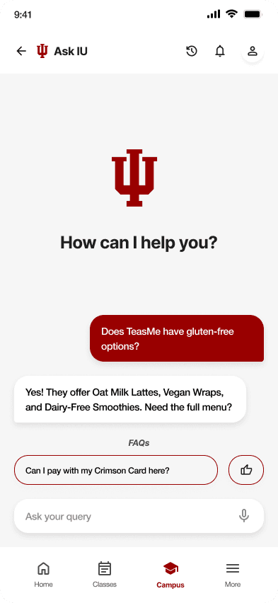
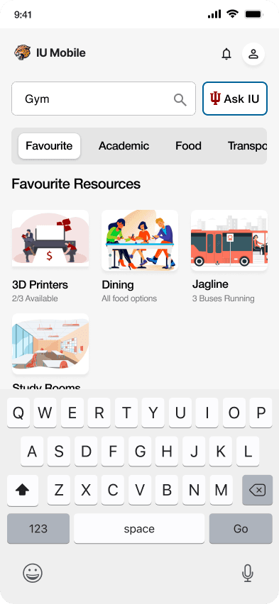
Access IU is a feature upgrade in the IU Mobile App to help 30,000+ students easily find and use campus resources. I led UX design and research for a new Resource Dashboard, Booking System, and Chatbot Assistant.
🎉 Results
In collaboration with IU’s Chancellor’s Office and UITS(University Information Technology Services):
- 63% of users discovered resources they hadn’t known before
- 85% found the prototype ready for real-world use
- Approved for rollout post-graduation
- Improved usability, discoverability, and task flow through smart filters and maps
👩🏻💻 My contributions
- Led UX research (interviews, surveys, heuristic evaluations, usability testing). Designed the end-to-end experience: dashboard, real-time booking, chatbot
- Defined features and information architecture based on student needs. Collaborated with stakeholders to align on privacy, data accuracy, and integration feasibility
- Created prototypes and design systems using Figma and Framer.
The Challenge
Students struggle to find and access essential campus resources due to scattered information, unclear navigation, and lack of personalization within existing systems.
Role
UX Design Researcher
Team
2 UX Designer
2 UX Design Researcher (Including me)
Tools
Figma, FigJam, Zoom, Miro, Google Forms, Office 365, Pen & Paper
Timeline
Aug 2024 - May 2025
Mission
To simplify campus life by centralizing student resources within the IU Mobile App - making access to support, services, and information faster, easier, and more personalized for every student.
😓 The Problem Statement
Imagine it’s your first week at Indiana University
You’re late to class, hungry, and trying to find a microwave. You open the IU Mobile App. Scroll… tap… nothing useful. You try Google. Still no help. You give up and head home.
That small frustration? It happens every day - and it stacks up.
87%
of students couldn’t find basic campus resources
70%
jump between 3–5 apps just to complete one task
50%
abandoned the IU mobile app after just one week

“I just end up asking a friend or wandering around… the app doesn’t help much.” - IU Grad Student
🔍 Design Challenge (How might we?)

How might we transform scattered campus information into a unified platform that helps students discover and make better use of available resources?
💡 Introducing Access IU
A reimagined experience inside the IU Mobile App: Our solution is a centralized and intuitive experience built right into the campus section of IU Mobile App. We designed it with key research insights in mind, especially around resource accessibility, personalization, and usability.


Lets dive deep into the process, shall we? 🕵🏻
Step 1: Empathize
(Understanding the Problem)
We used the Design Thinking framework to guide our process:
📊 20+ survey responses
🎤 6 in-depth user interviews
📚 10+ literature review
🔍 Competitive Analysis on Purdue University, University of Michigan, University of Illinois Champaign apps and also the current Indiana University App
Key Insight: Students were overwhelmed by fragmented information and preferred mobile-first, on-demand tools.
Step 2: Define
(What exactly is the problem?)
We mapped insights into clear user needs:
✅
Real-time access to campus info
✅
Personalized experience
✅
Unified and mobile-friendly
✅
Easy navigation, not endless scrolling
“Why isn’t everything I need just in one place?”
- First-Year Student
Step 3: Ideate
(What can we do to solve it?)
Now that we deeply understood the challenges students face, we began shaping a solution that would feel intuitive, useful, and grounded in real campus life.
Our Concept?
A centralized and personalized resource hub, built right into the existing IU Mobile App - no separate downloads, no fragmented systems.
We focused on three pillars:
👩🏻💻
Personalization → adapt to how each student uses campus
⏱️
Accessibility → make resources easy to discover
🔬
Clarity → reduce cognitive load with thoughtful structure
Step 4: Design
(Lets make it real)
We mapped insights into clear user needs:
✅
Real-time access to campus info
✅
Personalized experience
✅
Unified and mobile-friendly
✅
Easy navigation, not endless scrolling
“Why isn’t everything I need just in one place?”
- First-Year Student
Step 5: Test
(Does it solve the problem?)
We mapped insights into clear user needs:
✅
Real-time access to campus info
✅
Personalized experience
✅
Unified and mobile-friendly
✅
Easy navigation, not endless scrolling
“Why isn’t everything I need just in one place?”
- First-Year Student
👩🏻👨🏻Stakeholder Feedback & Validation
To validate our research findings and recommendations, we conducted think-aloud sessions and qualitative testing with 6 participants (3 firefighters, 2 EMTs, and 1 incident commander). Here’s what we found:
🔮 Learnings & Takeaways
🛠 Research is key – Groundwork ensures problem-solving accuracy and stakeholder buy-in.
🧠 Iterate based on real-world feedback – Practical usability validation is crucial in high-stakes scenarios.
💰 Adoption matters – AI solutions must be user-friendly and align with operational needs to gain traction.
📩 Interested in learning more? Let’s connect!

Let's be in touch!
Got a shower thought or UX crisis at 2 a.m.? I'm all ears for it ✨
Lets create something exceptional together!
Say Hello 👋🏼