Context
As a Product Designer at Pixibo, I led the transformation of the Find Your Fit® experience, revolutionizing how online shoppers find their perfect size across global fashion e-commerce platforms. In this case study, I will provide an in-depth exploration of the design process, unraveling the 'why' and 'how' behind the transformation of Shopify's Find Your Fit experience.
Role
Product Designer
Team
1 Product Manager
4 Software Engineers
1 UX Designer(Me)
Timeline
July 2021 - December 2021
Mission
To transform Shopify's "Find Your Fit" into a user-centric, scalable solution that simplifies discovery, enhances personalization, and boosts engagement.
About the Product
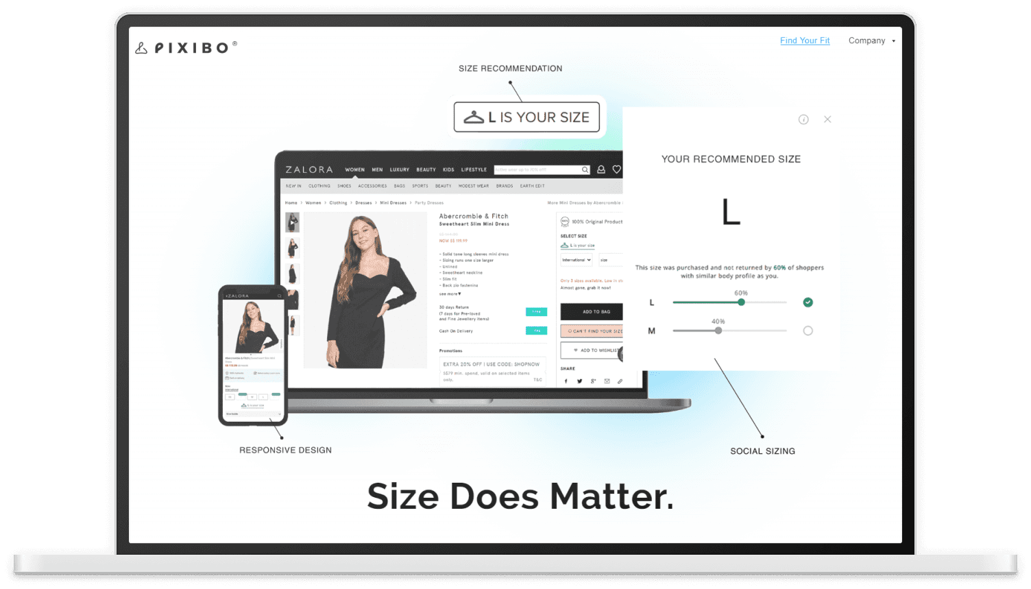
Pixibo's Find Your Fit® is a leading AI-powered size recommendation platform that transforms how people shop for clothes online. By combining advanced algorithms with intuitive design, the platform helps shoppers find their perfect size across different brands and styles, significantly reducing size-related returns for retailers.
The technology integrates seamlessly into e-commerce websites, offering personalized size recommendations based on:
✅ Individual body measurements
✅ Fit preferences
✅ Previous purchase history
Who is the User?
The primary user persona represents fashion-conscious online shoppers in Southeast Asia, including:
✔️ Sustainability-focused buyers (SANS FAFF, Align Swim)
✔️ Trend-followers (Colourful Rebel)
✔️ Premium fashion enthusiasts (JOSH V, Zalora Group)
They seek style and convenience but struggle with sizing uncertainties across brands, requiring a digital solution for accurate size recommendations to boost confidence and reduce returns.
Understanding the Problem Space (Heuristics) Why?
Scalability
Original architecture couldn’t support multiple brands, product types, and fit preferences.
Led to inefficiencies and made integration with new platforms difficult.
Navigation
Unclear information architecture caused duplicated features and inconsistent flows.
Users lost context during setup, making the experience frustrating and inefficient.
Discoverability
Key actions (like starting Fit setup) weren’t visible or intuitive.
When users couldn’t see how their choices influenced results, they hesitated to proceed.
Visual Hierarchy
Users couldn’t easily identify primary actions or steps.
This led to confusion, errors, and a lack of trust in size recommendations.
User Pain Points
❌ Confusing task flows
❌ Inconsistent visual design
❌ Lack of contextual information to guide decision-making
#1 Dashboard
On this screen, users view a disconnected layout of four cards under a generic "[Mango]" header. The poor information architecture creates several user challenges:
Confusion about where to start the setup process
Difficulty tracking progress through setup steps
Inefficient navigation between different functions
Uncertainty about completion status
Lost time trying to understand relationships between different features
Reduced confidence in the platform due to unprofessional appearance

#2 Size Chart Creation
On this screen, users encounter three ambiguous options: "Smart Size Chart Builder," "Manual Size Chart Builder," and "Use a Size Chart of a popular brand." The interface suffers from poor information hierarchy and generic placeholder text, creating significant user challenges:
Users struggle to make informed decisions due to lack of clear option differentiation
Time is wasted trying to understand each option's purpose without proper explanations
Risk of selecting an inappropriate tool due to missing guidance
Potential task abandonment due to uncertainty and confusion

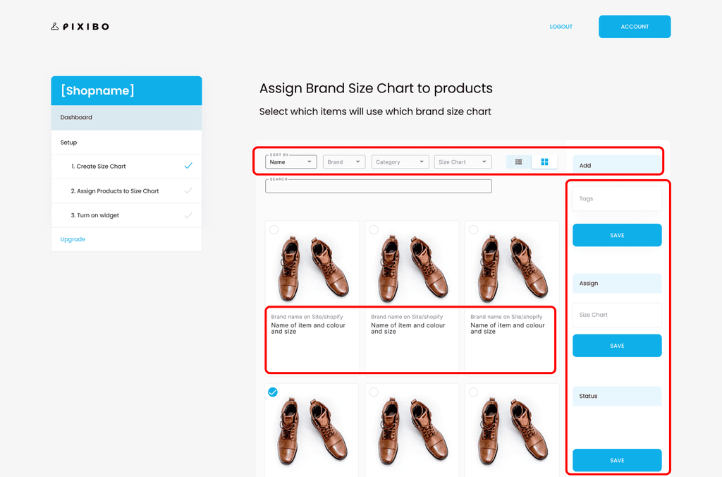
#3 Product Assignment
On this screen, users face a basic product management interface with limited filtering capabilities and redundant save buttons. These limitations create several operational difficulties:
Inefficient workflow due to inability to perform bulk actions
Time-consuming product management without clear organization tools
Risk of errors due to unclear save button functions
Frustration from limited filtering options causing excessive scrolling
Uncertainty about assignment status leading to double-checking work
#4 Widget Configuration
On this screen, users confront a technical implementation interface with complex terminology and developer-focused approach. This creates significant barriers:
Non-technical users feel overwhelmed by technical jargon
High risk of incorrect widget placement due to unclear instructions
Anxiety about making changes without visual preview
Time lost trying to understand technical concepts
Uncertainty about widget functionality leading to hesitation

Redesign Goals
The core challenge was to refine the shopping experience, balancing simplicity and functionality. The primary goal was to design an intuitive and engaging e-commerce platform that enhances the shopping journey for both merchants and customers.
Key Design Principles:
✅ Optimized user flow
✅ Seamless navigation
✅ Enhanced accessibility
✅ Clear visual hierarchy
Ease of Navigation
Ensure the design facilitates effortless exploration of the store, making it clear where the user should go next—whether it’s discovering products, adding them to the cart, or completing a purchase.
Reduce Friction
Minimize the number of actions (clicks, swipes, or steps) required to complete key tasks like searching for products or checking out.
Build Credibility and Trust
Establish a sense of reliability through clear communication, secure payment methods, and consistent branding, fostering confidence in both merchants and shoppers.

#1 Dashboard
The welcome screen now provides:
Clear value proposition explaining the product's benefit
Visual three-step process with intuitive icons
Progress indicators showing completed steps
Descriptive text for each step's purpose
Logical flow with arrow indicators between steps
Clear call-to-action with "Get Started" button
These improvements create a cohesive onboarding experience that guides users confidently through the setup process.
Old Design
New Design

#2 Size Chart Creation
The redesigned screen now offers two clear, distinct options with video previews: "Size Chart Builder" and "Size Chart Finder." Each option includes:
Clear purpose statements and usage guidelines
Visual preview with video tutorials (2:36 duration)
Distinct visual treatment highlighting the recommended option
Specific "When to use" scenarios reducing decision paralysis
These improvements help users make informed decisions quickly and confidently about which tool best suits their needs.
Old Design
New Design

#3 Product Assignment
The product verification interface has been enhanced with:
Clear status indicators showing "Brand Check Completed" and "SKU Check Completed"
Comprehensive filtering system with Gender, Brand, Product Category, and Size Chart options
Bulk assign functionality for efficient product management
Visual product cards with pre-filled information
Undo/Redo/Refresh actions for error recovery
These improvements streamline the product assignment process and reduce user effort through automated checks and bulk actions.
Old Design
New Design
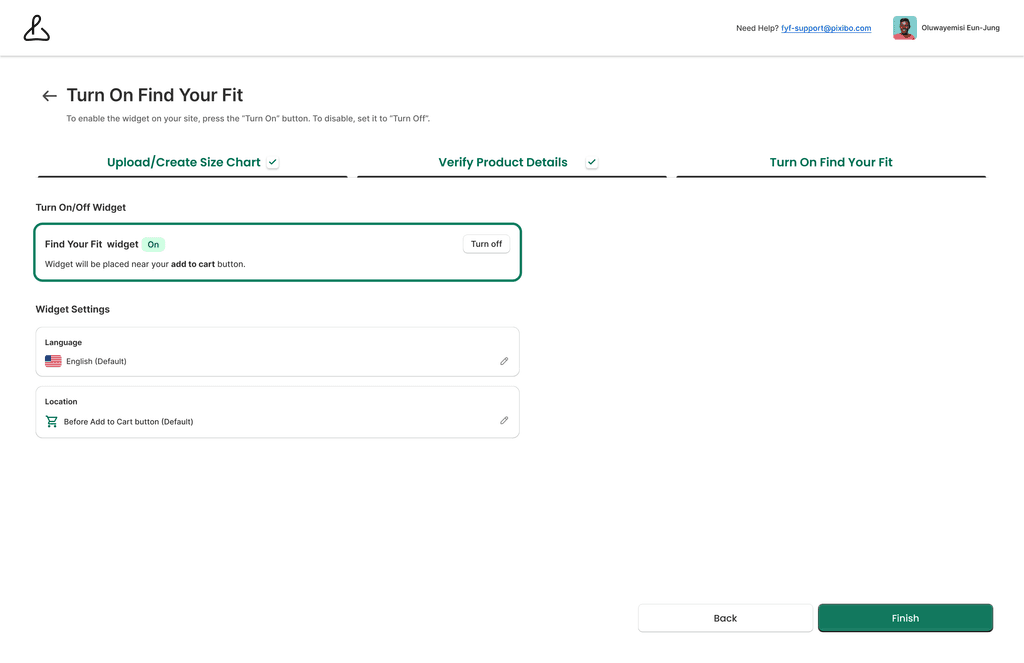
#4 Widget Configuration
The widget setup screen has been simplified with:
Clear On/Off toggle with visual feedback
Simple language explaining widget placement "near your add to cart button"
Straightforward language settings with flag icons
Precise location settings with cart icon
Clear "Back" and "Finish" actions
The technical complexity has been replaced with user-friendly controls and visual confirmations of settings.
Old Design
New Design
Lets talk numbers - Impact (Post Redesign)
47%
Sales Coverage Rate
35-50% of sales expected to be covered by Pixibo users in the first year
27%
Higher Conversion Rate
CR are 20-30% higher than the size-chart conversion rate within the first 3 months
4%
Reduced Order Return Rate
3-4% reduced order return rate for Pixibo powered purchases by the end of year 1
Testimonials
See what the customers said about Find Your Fit
Empowering brands with seamless designs that elevate shopping experiences and drive growth.


Let's be in touch!
Got a shower thought or UX crisis at 2 a.m.? I'm all ears for it ✨
Lets create something exceptional together!
Say Hello 👋🏼